Use 'Heading' styles to make your content more readable
Reading a page of solid text is not going to encourage the viewer to read it. People read web sites differently
from other media, mainly because they are usually searching for a specific piece of information. Heading styles can be used to break up your article into easily scannable sections.
Here are the Heading styles used on this web site:
Heading 1
Heading 2
Heading 3
Heading 4
Heading 5
|
|
As you can see all the heading styles use the same font style but have different sizes, colours, and space before and after the heading, giving them different emphasis on the page, e.g. Heading 1 is the most prominent, just like section headings in a book.
Heading styles should be used instead of simply changing the colour, or font style, of a section heading. This is because 'Headings' are a recognised component of a web page that other software may require to read your web pages properly e.g. blind or partially sited users may use a screen reader. It also makes it easy to maintain a consistent look to your pages and if you want to chnage the look of your web site you can simply update the heading style in the theme rather than update every individual article. |
 Adding a Heading style
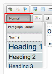
Within the document editor you can select from up to 5 heading styles from the styles selection list, as shown in the image on this page. First select the text you wish to modify and then select the required heading style from the list.
When adding heading styles you should start with “heading 2” (Heading 1 is used for the article title) and then only use other heading styles when you need to title a subsection of heading 2. Skipping a heading style e.g. going straight from Heading 1 to Heading 3, is often considered bad practice on web pages.